For those of you still coming to terms with this whole ‘graphical abstract’ thing, this may sound odd – but I went and created a 3-part graphical abstract for my latest paper. In a previous post I wrote about how to create a simple graphical abstract but here I took things one (or two) steps further.
I first put the idea of a 3-part graphical abstract to the Twitter #scicomm community to see what they thought. They were amazingly helpful (thanks everyone!) and had some great suggestions for ensuring the separate graphical abstracts still matched or worked together. Overall people thought that creating 3 separate graphical abstracts rather than mashing my findings together into one larger (inherently more confusing) graphical abstract was a sensible move.
My reasoning was that this particular paper was the summation of my PhD research and so as you can imagine – quite detailed. But it also resulted in 3 distinct sets of findings: methodology, new open-access data and implications for urban food growers. Thus when it came time to design a graphical abstract for this paper I could not find a way to mesh these three stories together in a simple visual way.
Below you can see BIG differences from how each abstract started (just throwing colours and blocks around!) compared to how they turned out. Use the slider on the Before and After images to move right and left to see.

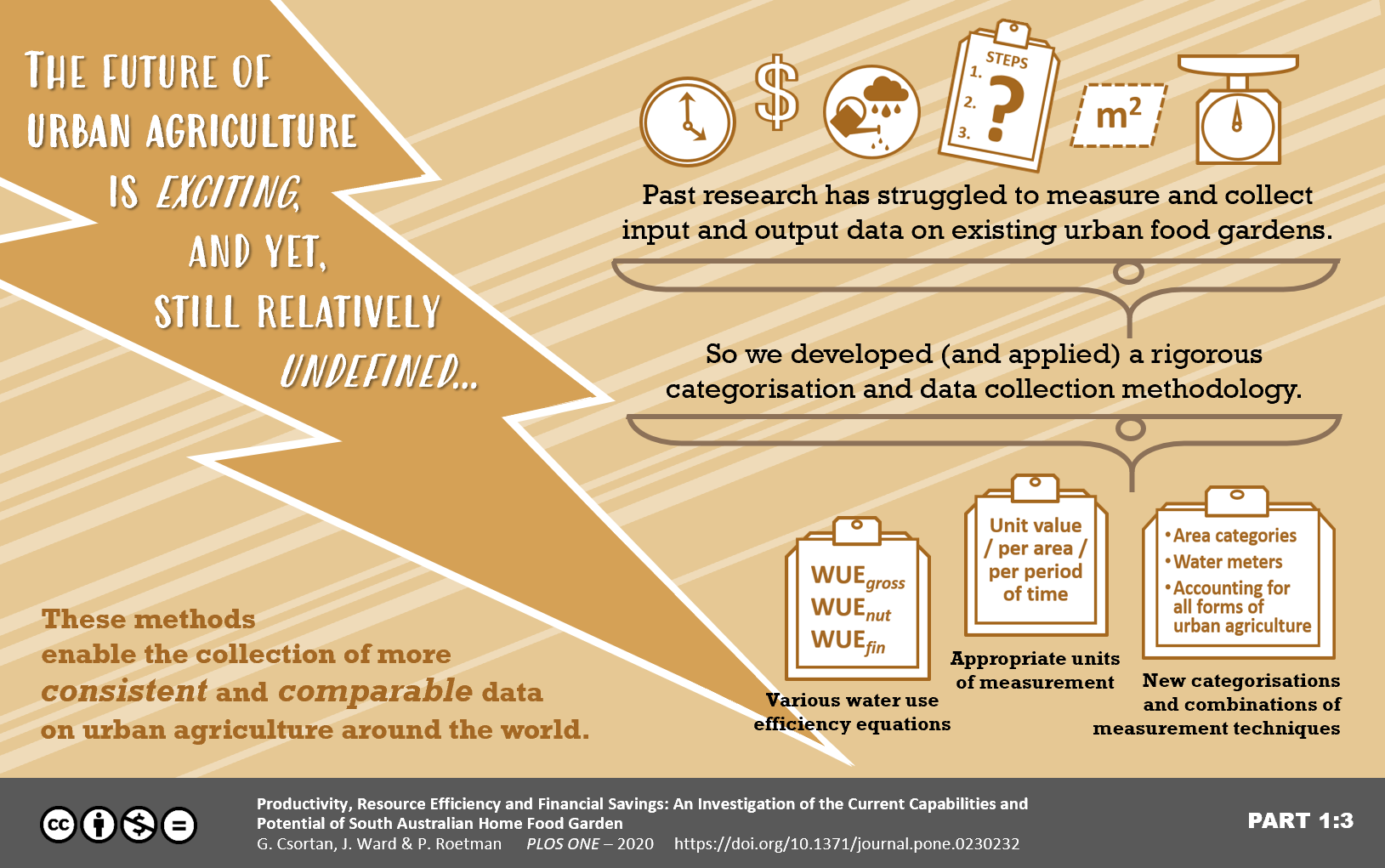


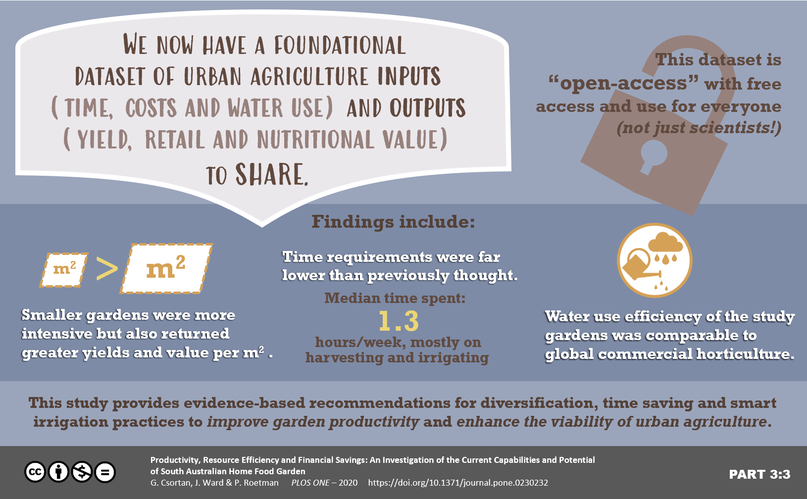
In the end I decided to create 3 graphical abstracts which shared a similar visual look and were linked to each other as parts 1/3, 2/3 and 3/3. But they still had to fit with our concept of a graphical abstract as; “a concise, colourful and engaging visual explanation of the take-home message of the paper”.
I admit they took a while to create (try weeks!), mostly at the beginning while I was trying to come up with a set of themed colours and related formats. Once I settled on those it was then simply lots of wordsmithing and tweaking visuals and placement. The final products have muted (but still friendly) colours, a main focus on the headings or catch lines, and different visuals to keep them interesting.
Do I think they worked well? For me – yes. These abstracts can be used together, or separately to target slightly different audiences. I’ve been able to share these on different social media platforms and with traditional media as part of press releases. They draw people in and hopefully quickly communicate the take-home messages of my research.
What do you think? Have you ever considered a multi-part graphical abstract for some of your more complex or
multi-faceted work?
I would love to see your own graphical abstracts or hear whether you think you could use a multi-part one yourself.
As an added bonus I heard from the amazing Dr. Echo Rivera (@echoechoR) who has written a very handy blog post on how to create animated graphical abstracts if you usually create your abstracts using Powerpoint. This could lead to your work and social media posts receiving higher numbers of interactions, clicks and views! I for one am definitely going to give this a go.
Cheers!
Georgia

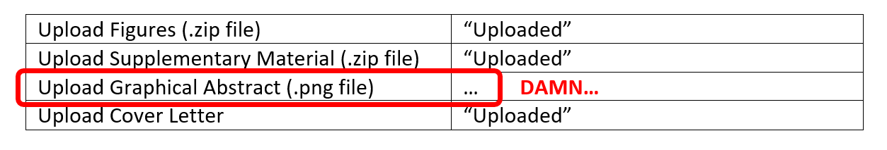 For many of us, reaching this point in the submission of your paper and then realising that you don’t have a graphical abstract ready is just a pain you don’t need. By the end we often don’t have the time or energy left to deal creatively with thinking up yet another way to explain our research.