A 3-part graphical abstract?

For those of you still coming to terms with this whole ‘graphical abstract’ thing, this may sound odd – but I went and created a 3-part graphical abstract for my latest paper. In a previous post I wrote about how to create a simple graphical abstract but here I took things one (or two) steps further.

I first put the idea of a 3-part graphical abstract to the Twitter #scicomm community to see what they thought. They were amazingly helpful (thanks everyone!) and had some great suggestions for ensuring the separate graphical abstracts still matched or worked together. Overall people thought that creating 3 separate graphical abstracts rather than mashing my findings together into one larger (inherently more confusing) graphical abstract was a sensible move.

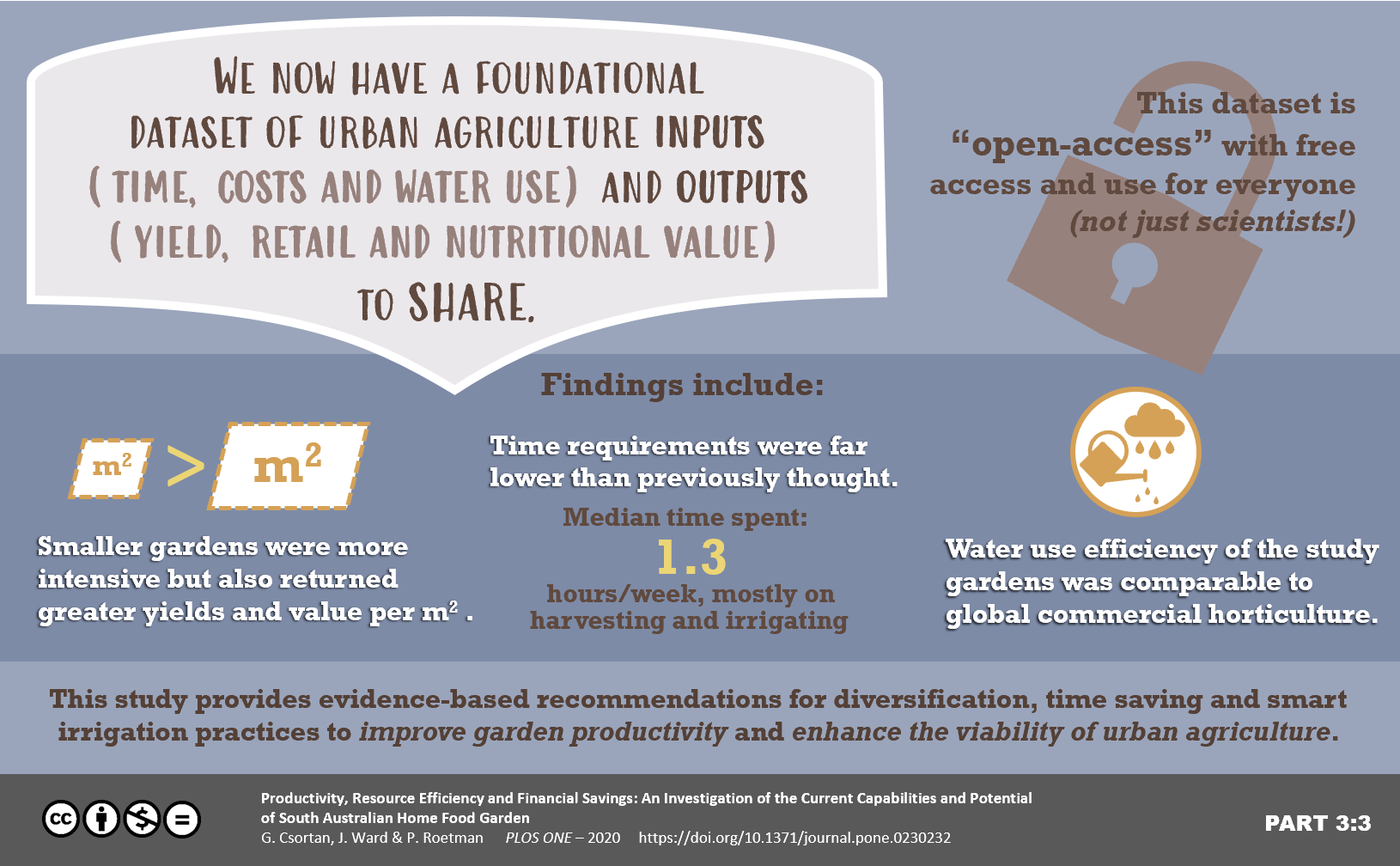
My reasoning was that this particular paper was the summation of my PhD research and so as you can imagine – quite detailed. But it also resulted in 3 distinct sets of findings: methodology, new open-access data and implications for urban food growers. Thus when it came time to design a graphical abstract for this paper I could not find a way to mesh these three stories together in a simple visual way.

Below you can see BIG differences from how each abstract started (just throwing colours and blocks around!) compared to how they turned out. Use the slider on the Before and After images to move right and left to see.

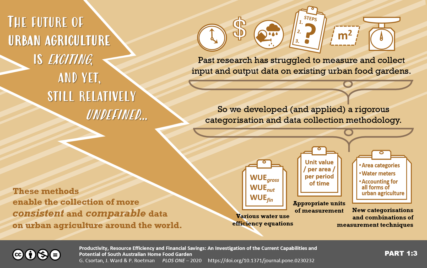
 

In the end I decided to create 3 graphical abstracts which shared a similar visual look and were linked to each other as parts 1/3, 2/3 and 3/3. But they still had to fit with our concept of a graphical abstract as; “a concise, colourful and engaging visual explanation of the take-home message of the paper”.

I admit they took a while to create (try weeks!), mostly at the beginning while I was trying to come up with a set of themed colours and related formats. Once I settled on those it was then simply lots of wordsmithing and tweaking visuals and placement. The final products have muted (but still friendly) colours, a main focus on the headings or catch lines, and different visuals to keep them interesting.

Do I think they worked well? For me – yes. These abstracts can be used together, or separately to target slightly different audiences. I’ve been able to share these on different social media platforms and with traditional media as part of press releases. They draw people in and hopefully quickly communicate the take-home messages of my research.

What do you think? Have you ever considered a multi-part graphical abstract for some of your more complex or
multi-faceted work?

I would love to see your own graphical abstracts or hear whether you think you could use a multi-part one yourself.

As an added bonus I heard from the amazing Dr. Echo Rivera (@echoechoR) who has written a very handy blog post on how to create animated graphical abstracts if you usually create your abstracts using Powerpoint. This could lead to your work and social media posts receiving higher numbers of interactions, clicks and views! I for one am definitely going to give this a go.

Cheers!
Georgia

Let’s talk “Graphical Abstracts”

If you’re a scientist, and have had something published recently, chances are you’ve come across this option when uploading your final reviewed, edited and approved copy of your manuscript:

uplaoding graphical abstract to journal websiteFor many of us, reaching this point in the submission of your paper and then realising that you don’t have a graphical abstract ready is just a pain you don’t need. By the end we often don’t have the time or energy left to deal creatively with thinking up yet another way to explain our research.

But hear me out. I want to help you understand the benefit of a good graphical abstract, why you should consider putting the extra effort in to create one, and a few tips on how to go about it.

Read More »

Keeping Data Personal: Big scopes, little people

Every now and again I wonder about whether big data can still be personal. This generally occurs after I get a pop-up on my computer or an up-date on my phone which asks if they can track and use my background data.

But it does get me thinking – I hear a lot about us being in the era of “big data”, with mass data collection all around. Some of this is used to categorise us according to our likes and shopping desires. Some is used to actually better the systems and interfaces we work with.

But I know from my own data collection experiences how easy it is (once everyone’s answers are turned into numbers and categories), to lose sight of what those answers really mean in context to each person, and in turn what this means for your research.

But there are people out there making huge efforts to keep our interfaces, data collection and communications not just individual but personal too. I only recently watched a TED Talk by Aaron Koblin from 2011 called, “Visualizing ourselves… with crowd-sourced data”.Read More »

A WISE Event: All the Career Possibilities

One brisk Monday night, a large roomful of women gathered in the silver mirrored SAHMRI building to hear from three amazing women / successful scientists who have trodden a wide range of career pathways and ended up in jobs very different to those they first imagined.

The first speaker was Dr Kate Gridley, now a Research Coordinator in the Division of Health Sciences at the University of South Australia. Check out Dr Gridley’s homepage at – http://people.unisa.edu.au/Kate.Gridley

Dr Gridley started with showing us the difference between her assumed career path once she had finished studying, to the path she actually took – winding in and out of different positions.

The jump from hands on PhD research, to a more administerial position required a serious effort in translation. Mostly, the translation of all the skills Dr Gridley had honed during her PhD to be shown as applicable and valuable skills for non-research work. She spoke of learning to, “sell myself as an asset…” and, “remaining open to any options”.

Dr Gridley finished with asking us, the audience, to think more about our future career and to practice selling ourselves and our skills as transferable to any position.

Read More »

Book breakdown – “Don’t be such a scientist” Part 2

Here we cover the next part of Dr Randy Olson’s insightful book:

“Don’t be so literal minded”

Olson builds on the first part of his book by describing some of the struggles scientists can have when trying to communicate to those outside of academia. Logical, literal and data based arguments (the head perspective) can be up against an unfair fight when emotional or instinctive arguments (the heart or gut perspectives) are used against them. And who else, besides the scientists themselves, pride themselves on using purely logical, literal and data-based arguments? No-one. Not governments or politicians. And not businesses or industries.

In this loud, information overloaded world – if you as a scientist are attempting to engage anyone outside of academia in the work you have done, it’s not always enough that your work is rigorous or has real-world implications. You will have to promote your work a little… or a lot, to be heard.

Read More »

Why online presence is important for all scientists: The League of Remarkable Women in Science, interview Dr Rachael Dunlop

What a brilliant interview with Dr Rachael Dunlop – I love the idea of starting by learning to communicate effectively and THEN getting into science. Possible a harder way of doing things but she has made it a success.

Read More »

It all had to start somewhere.

At the end of Year 12, I decided I wanted to go to university and do a double degree in Environmental Science, and Fine Arts. Except… that this didn’t exist.

I was told that it had never been done before, and that there were no processes in place to facilitate such a combination.

But I was convinced that there was such potential, and so many connections and similarities between science and art. Art is expression, emotion and all about telling a story (even if you don’t know what the story is). Science is observation, exploration and logically figuring things out.

Both are attempts to gain understanding.

But I was younger, and new to how universities worked and I let the idea go. I began the four years of environmental science it took to get me here at the beginning of a PhD. With what I now know – I wish I could go back and fight for that double degree. I would have said, “This is where the future is heading and I want in. I know we can figure it out somehow.” But I didn’t and that’s okay too. Because between my PhD, this new blog, and my artwork – I’m getting there anyway.