
If you’re a scientist, and have had something published recently, chances are you’ve come across this option when uploading your final reviewed, edited and approved copy of your manuscript:
 For many of us, reaching this point in the submission of your paper and then realising that you don’t have a graphical abstract ready is just a pain you don’t need. By the end we often don’t have the time or energy left to deal creatively with thinking up yet another way to explain our research.
But hear me out. I want to help you understand the benefit of a good graphical abstract, why you should consider putting the extra effort in to create one, and a few tips on how to go about it.
First step – what exactly IS a “graphical abstract”?
According to Elsevier, a graphical abstract is a, “single, concise, pictorial and visual summary of the main findings of the article“… now before you fall asleep, they go on to explain that a graphical abstract, “should allow readers to quickly gain an understanding of the main take-home message of the paper“.
I want to take this definition a little further and add some “movement” to it. What about, “Graphical abstracts are a concise, colourful and engaging visual explanation of the take-home message of the paper”. At least then we can get a bit more excited about them!
What is the benefit of a good graphical abstract?
You have probably read before about the value of disseminating your research or scientific paper into a few different ways to help target different audiences. A colourful and visual explanation of your work can help attract interest from people who might not normally understand or care. Think less about targeting other scientists and more about targeting everyday people.
A good graphical abstract can stand alone as an engaging explanation or it can be paired with other written explanations – blog posts, newspaper articles, updates on your university website, as the star figure on your conference poster etc.
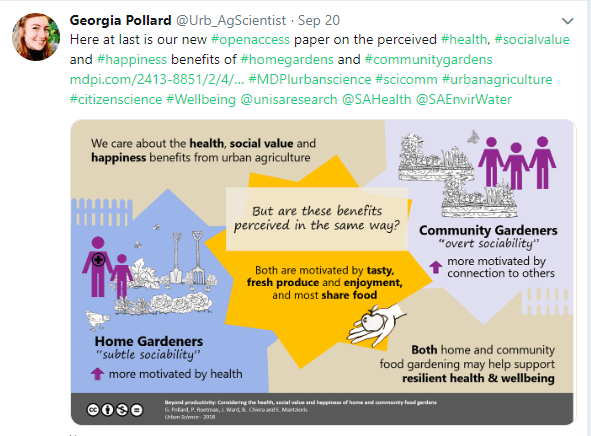
When it comes to social media, a graphical abstract looks way more interesting and is likely to encourage people to “click” more than a simple web-link on different platforms such as Twitter, Facebook, LinkedIn, Google+, Reddit or Mendeley. For example below, the first Twitter post (no image – not so fun), compared with the second Twitter post (way cooler! & colourful!)

And one final benefit is that your family might finally understand what your research is all about. I showed a couple of my graphical abstracts to some of my family and they went, “Oh THAT’s what you’re working on!”.
How to CREATE a graphical abstract
If you have a little bit of time and creativity and are keen to give creating your own graphical abstract a go – then here are some basic tips.
Tip 1: You don’t need fancy design software. If you already have fancy software and know how to use it, that’s awesome. But if you don’t – don’t worry. I personally use “PowerPoint” to create mine, but you can also try using Word, Publisher or any of your built-in basic drawing software. If you can create different shapes, pick your own colours and add text – you’re golden.
Tip 2: Decide on the simple underlying “story” of your paper. This usually takes me a few goes to get right down to the most important thing to communicate. Go wild – scribble out your ideas on real paper. That way you can scrunch or rip it up satisfyingly when you want to try another way. If stuck try starting with the traditional opening story line, “Once upon a time, in a lab / field / office far away…”
Think of 4 or 5 main points – one sentence each. You’re telling a super short story.
This means simple language (no jargon and no acronyms).
Point 1 = The “big picture” where does your research fit in the world?
Point 2 = What is the question, issue, challenge or problem to overcome?
Point 3 = Your key results or findings. (short & simple)
Point 4 = What do these results or findings mean? What is the impact? How will it help or change things?
Tip 3: Pick only a few (2 or 3 or 4) colours and stick with them. You don’t want to overload on the colours – no rainbow spectrum (unless you’re studying light or lasers or something cool like that). Think either “complementary” colours – colours that work well together. Or you could try picking contrasting colours – colours that really stand out against one another. It’s also worth considering different text colours and fonts.

Tip 4: Keep your layout simple – think almost comic book style. Try some basic layout shapes like these below, or layer different shapes and then crop to your outline.

Tip 5: Add visuals which help support your “story”. Use drawing / cartoon style images where possible. If you can draw some of the figures yourself that’s great! Maybe you have a touch-screen laptop or app and can draw them right onto the screen. Or you could even draw them on paper and take a photo. Then email the photo or upload it onto your computer and use the “Remove background” or “Set transparent colour” function in Microsoft Word to get rid of the background.
You can also try using this cool free online software “Autodraw”. You scribble the shape or picture you want and the software uses machine learning to translate your scribble into a proper shape or line image. You can layer shapes and images to make whatever you like and then download the result.
Tip 6: Don’t forget to add the appropriate licensing to your graphical abstract. Follow this link to learn more about the different symbols for “creative commons” etc. I use these symbols on my own graphical abstracts:

This was my first graphical abstract. I wanted a simple way to convey some of the complexity of measuring water use in urban food gardens and the contribution my work made to the field.

I used 3 main colours with the darker colour on the bottom to help add perspective. I used orange as a contrast colour. And I split the middle panel as I wanted to show the separate diversity of “watering gardens” on one side and “producing food” on the other side.
But what if I don’t have the time / motivation / creativity to make my own graphical abstract?
Well that’s okay too because there are a few people out there who are more than happy to help create a graphical abstract for you. Their styles, processes and prices vary a little but here are a couple of options:
- “Animate Your Science” – An Adelaide based company with very cool examples of graphical abstract designs: https://www.animateyour.science/ @Animate_Science
- “Mind the Graph”: https://mindthegraph.com/ I haven’t used them myself but have heard others recommend them.
I also highly recommend looking up these brilliant science communicators and graphical artists on Twitter, they too may be able to help you out:
- Dr Stacey McCormack @McCormackSA,
- The Amoeba Sisters @Amoebasisters
- Dr Eliza Wolfson @eliza_coli
And there you go – I hope this has inspired you to give making your own graphical abstract a go. It is very satisfying to view your published article on the Journal website and have your colourful graphical abstract appear front and centre.
Good luck!

[…] went and created a 3-part graphical abstract for my latest paper. In a previous post I wrote about how to create a simple graphical abstract but here I took things one (or two) steps […]
LikeLike